New Logo reflects NZ National Commission for UNESCO’s Kaupapa
The NZ National Commission for UNESCO has worked together with a leading designer from Whanganui City of Design to create a new logo which showcases our Kaupapa.
Our New Logo
“With UNESCO modifying their logo, we have taken the opportunity to add a new element to our logo which showcases the special contribution that we make to the UNESCO whānau, as well as the contribution that UNESCO makes to life in Aotearoa New Zealand,” says NZ National Commission for UNESCO Chair, Robyn Baker.
“At the time that we were looking to renew our logo, Whanganui had just been announced as a UNESCO City of Design, so it made very good sense to approach a Whanganui designer to develop a uniquely New Zealand logo,” says Robyn.
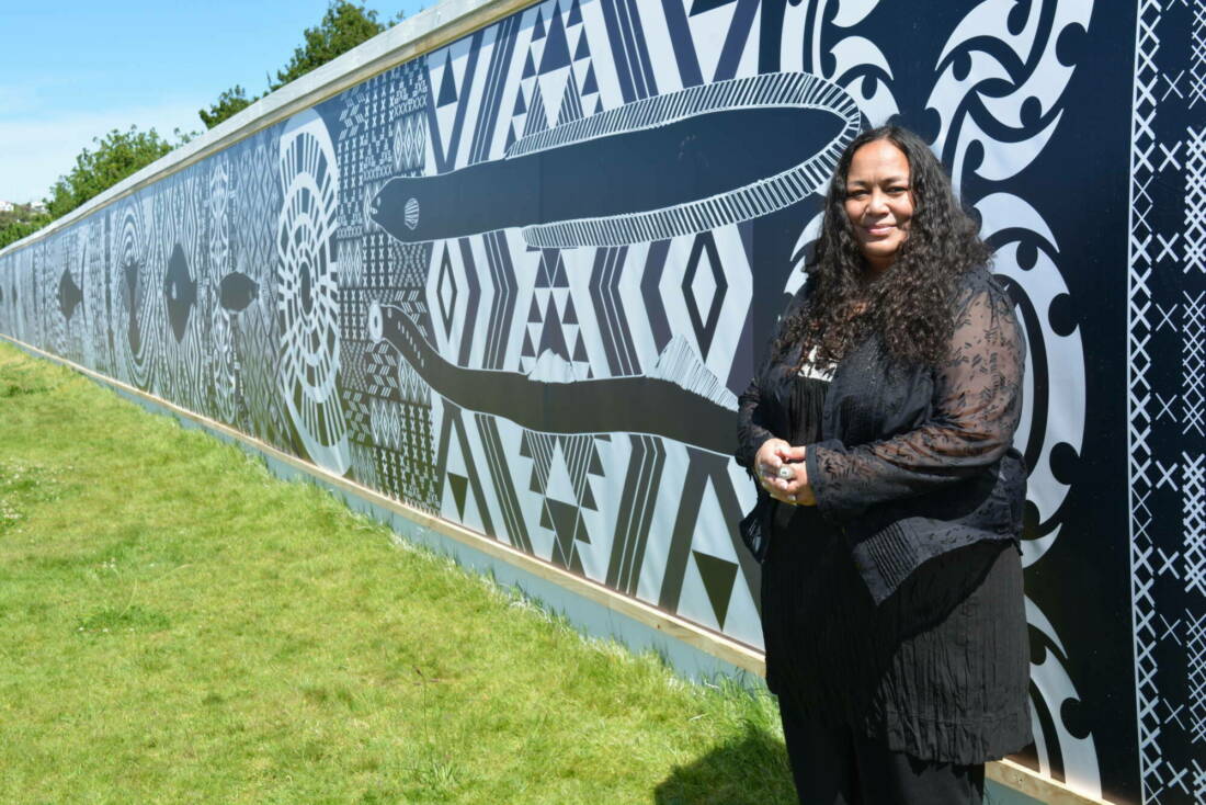
The design was developed by Cecelia Kumeroa and her colleague Andres Salinas and is derived from the kowhaiwhai design referred to as ‘Māui’.


'We were absolutely privileged to be asked to create the logo mark for New Zealand National Commission for UNESCO. This was a great opportunity to explore the many narratives of Aotearoa and to create something unique to our country that also fits with the directives of UNESCO,” says Cecelia.
“Maui is an enduring icon of our histories so creating a design that references this tupuna - who is recognised across our Pacific waters - made complete sense to us. It is a design that we can all relate to and celebrate as Aotearoa,” she said.

The Design Explained
At the centre of the design are two interlocking spirals which are a symbolic reference to the kōrero (narrative) about Māui-Tikitiki-a -Taranga - who hauled up the Northern Island of New Zealand.
‘Te Ika a Māui’ - the fish of Māui has further narratives connected to the founding of Aotearoa across various oral histories of tangata whenua.
Māui is a well-known hero in many stories across the Pacific, so the design is associated with innovation, ideas and capturing knowledge (te matau a Maui).
The triangular shapes are ‘niho-taniwha’, commonly used in carving design and also prolific to other design traditions such as kowhaiwhai and tā-moko.
This design is associated with strength and perseverance. The other spirals feature fine repeated ellipse shapes on a solid band. This is a form of ‘rauponga’ and is associated with the mamaku fern frond. The design is about growth.
